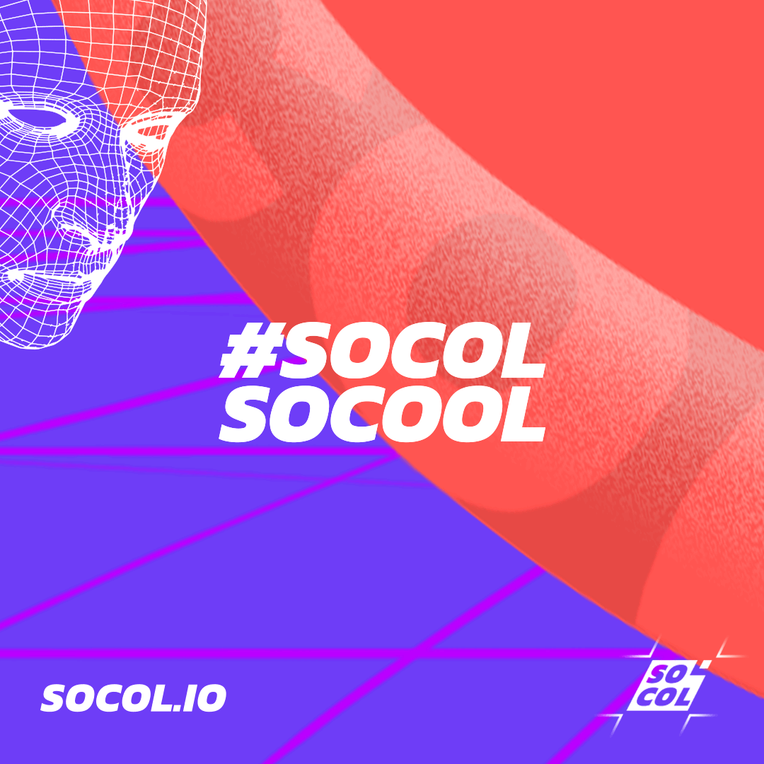
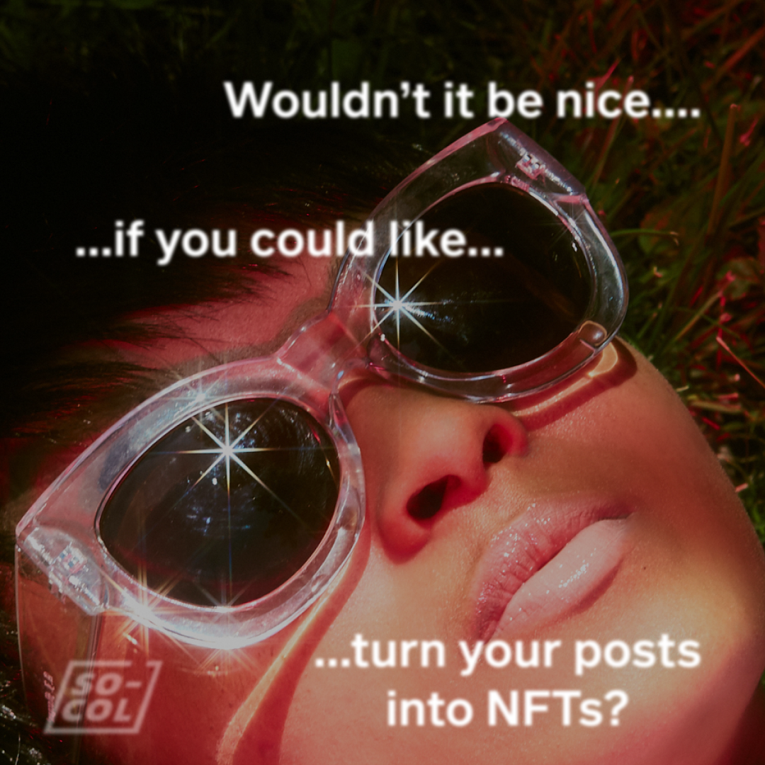
making SO-COL SO-COOL
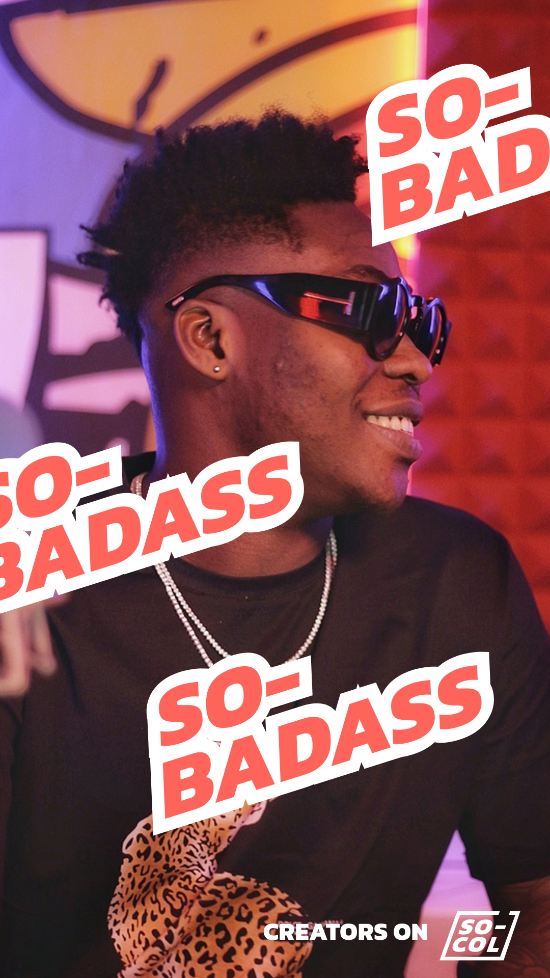
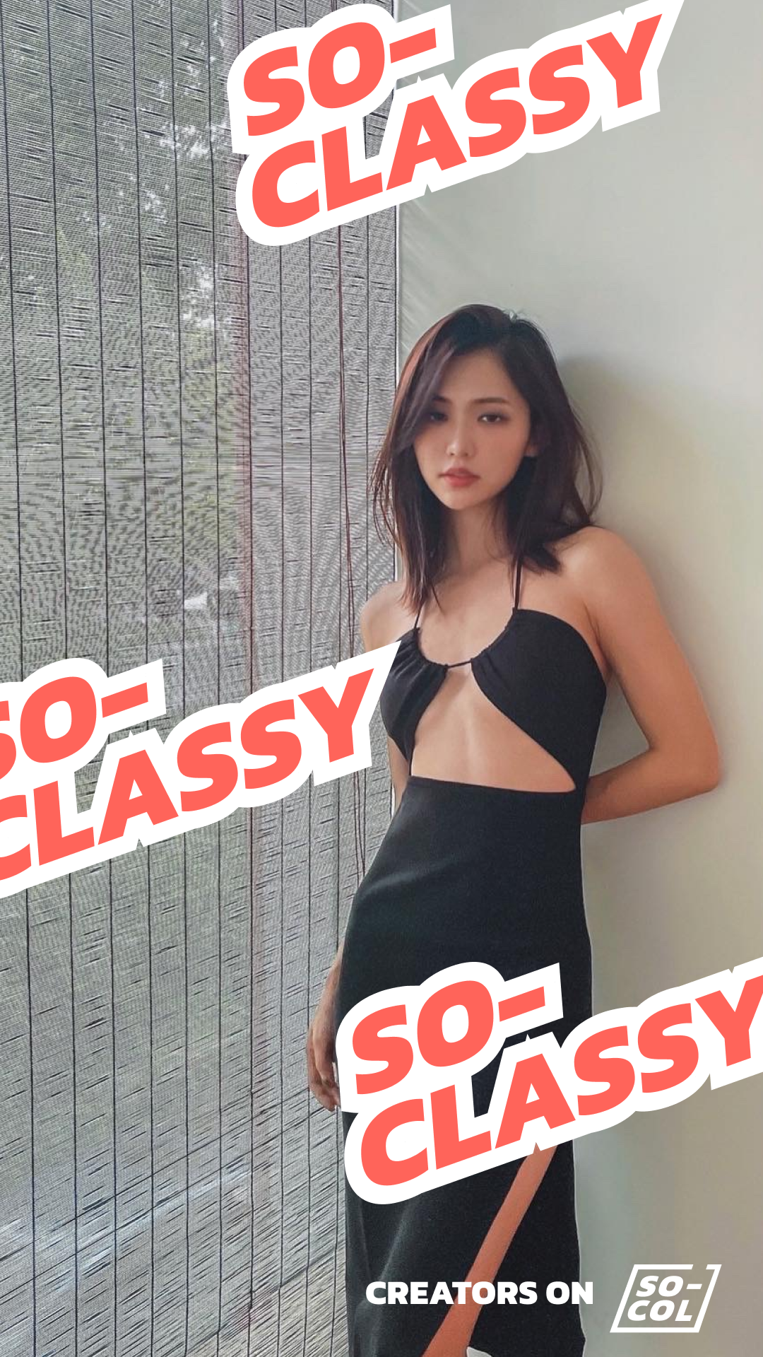
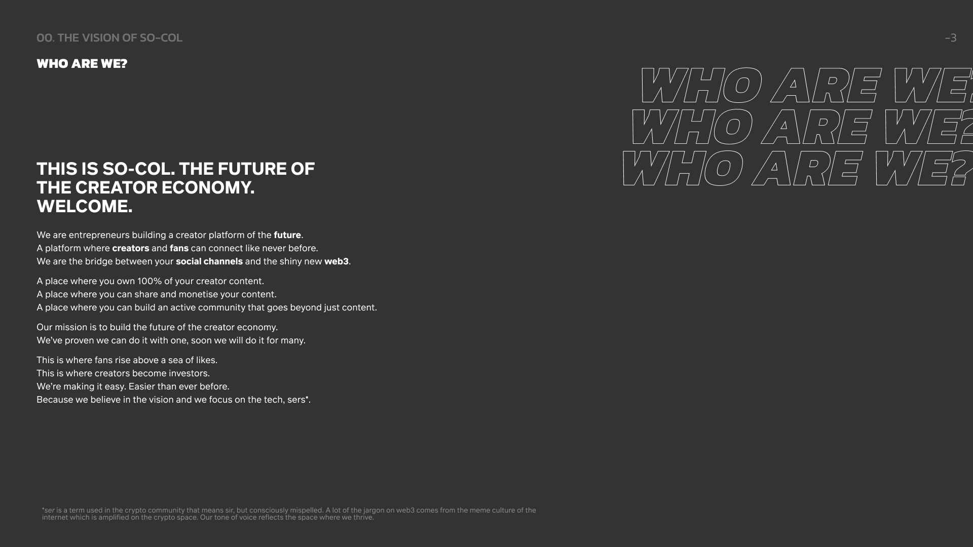
Here’s an overview of my work as Brand/Marketing Lead at SO-COL, an NFT-powered social network for creators (and brands) to build and grow their fan communities. I joined the founding team and built the brand from the ground up. From the logo, brand guides, (key change in brand spelling from Socol to SO-COL), disruptive campaign and activation ideas, event branding, X (Twitter) posts, Spaces banners, Zoom backgrounds, product UI direction, influencer content and so much more. This is how I made SO-COL, SO-COOL.
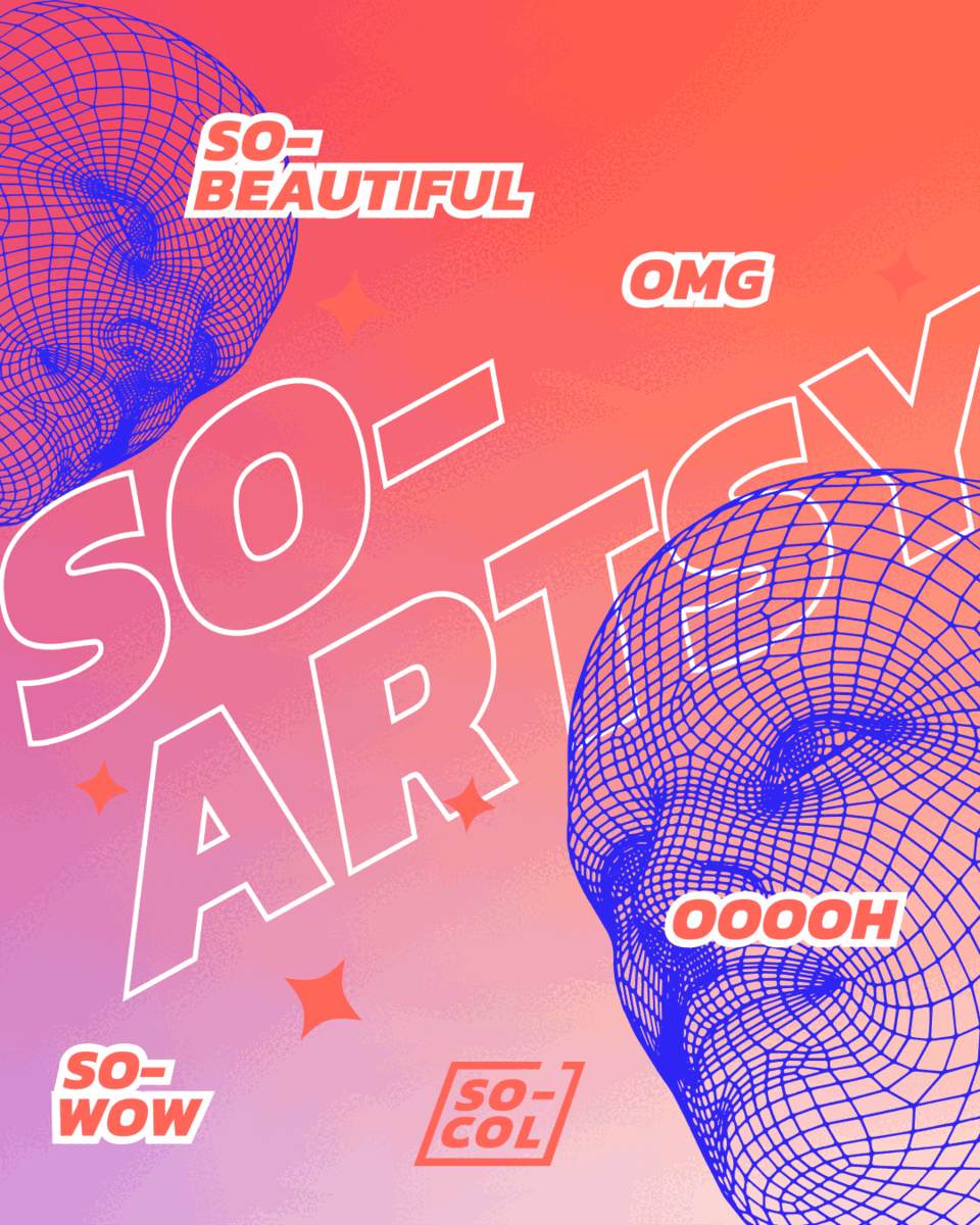
NFT designs for the SO-COL HQ sub communities. SO-VIBES, SO-TIGHT, SO-FOCUSED ON THE TECH, SO-ARTSY.

Click to play video


THE instagram launch grid
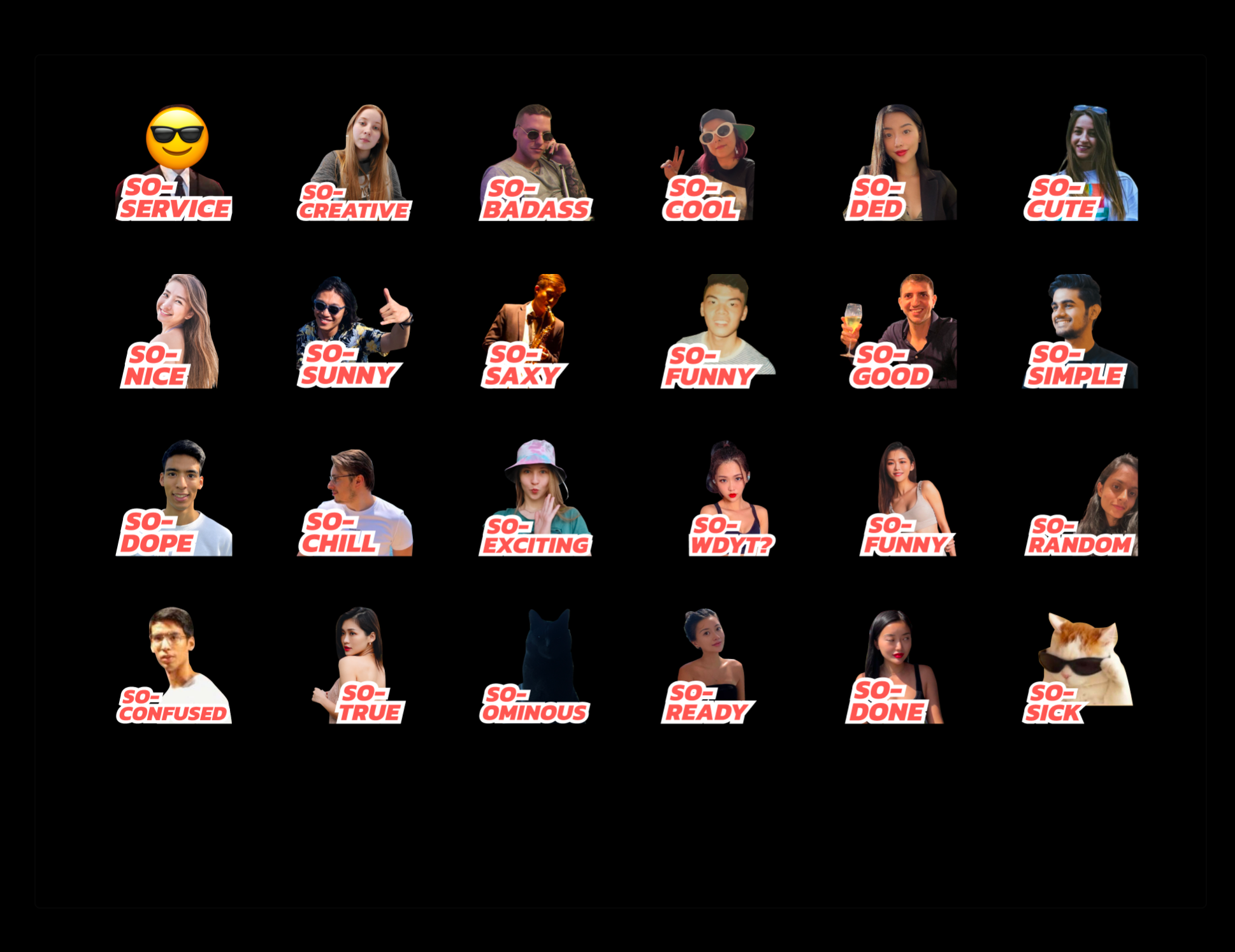
Telegram Stickers with team members. It increased brand loyalty and engagement internally (within the company) and externally as we used these stickers in our comms as well. The simple brand spelling change to “SO-COL” paved the way for SO-MANY-FUN-THINGS!

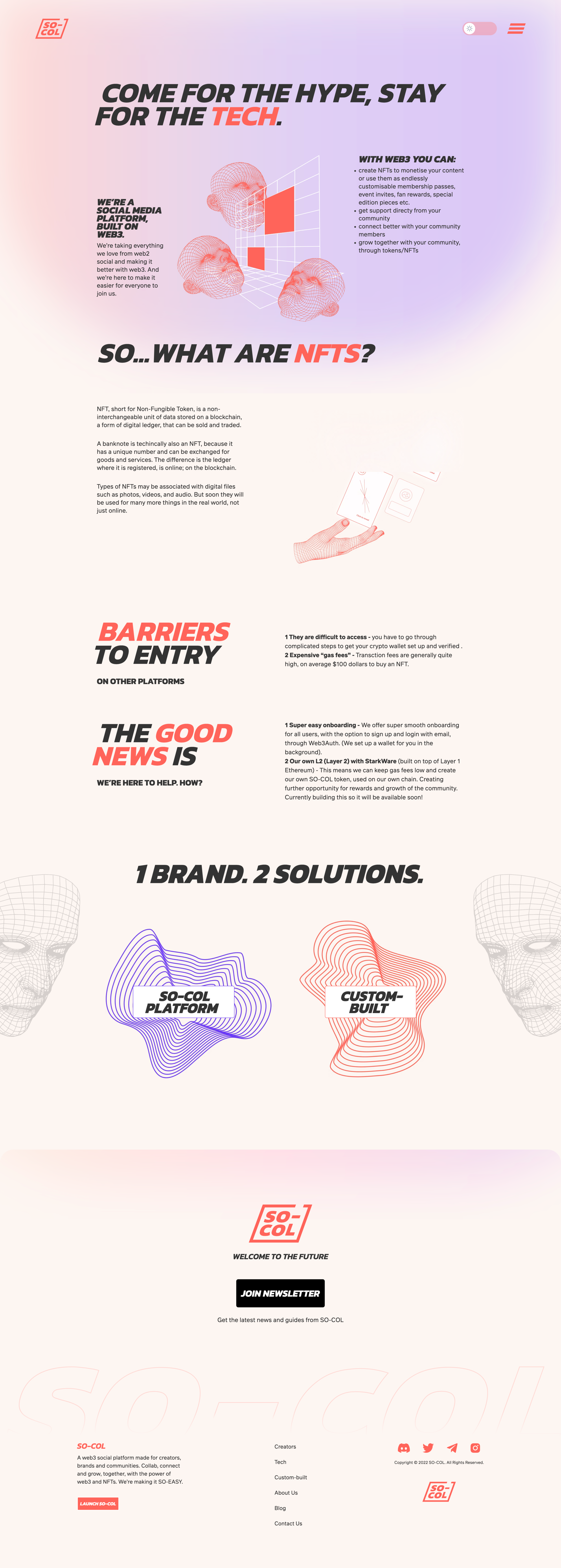
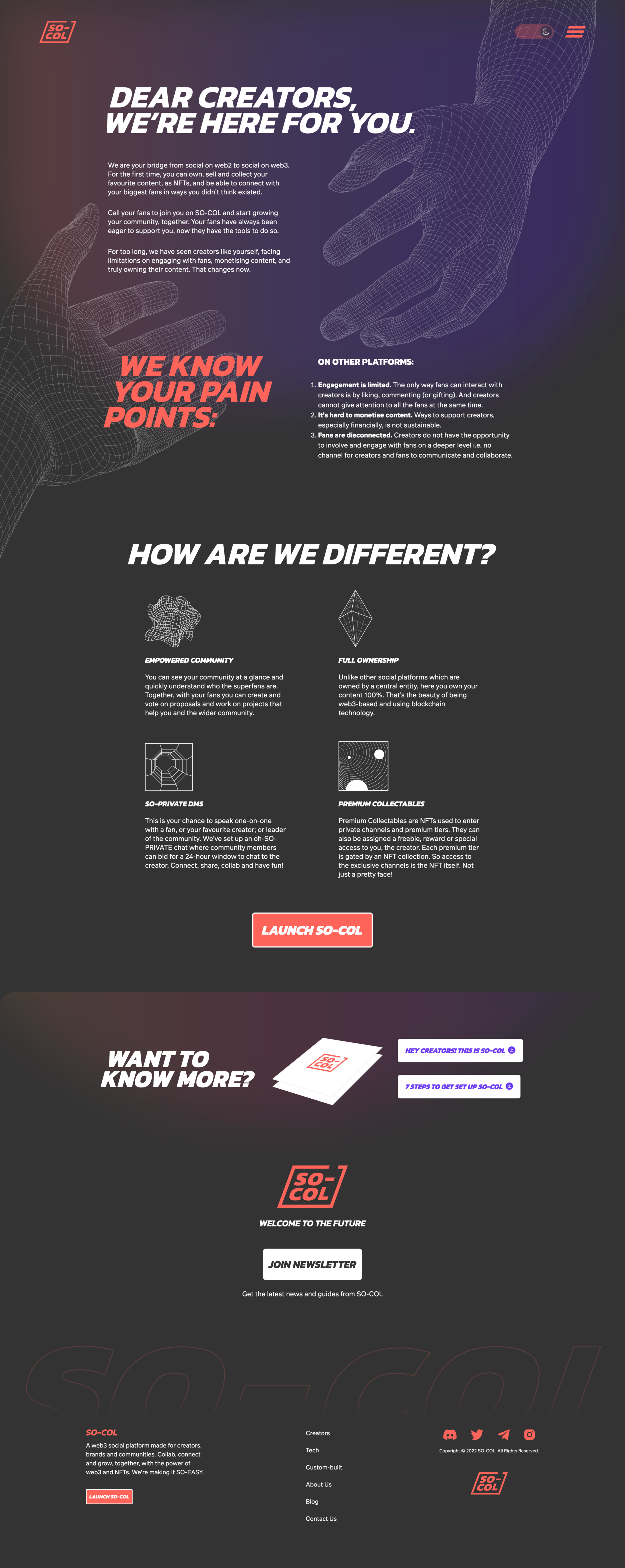
Website DESIGN I worked on from scratch:
(content and design) in light and dark mode of course


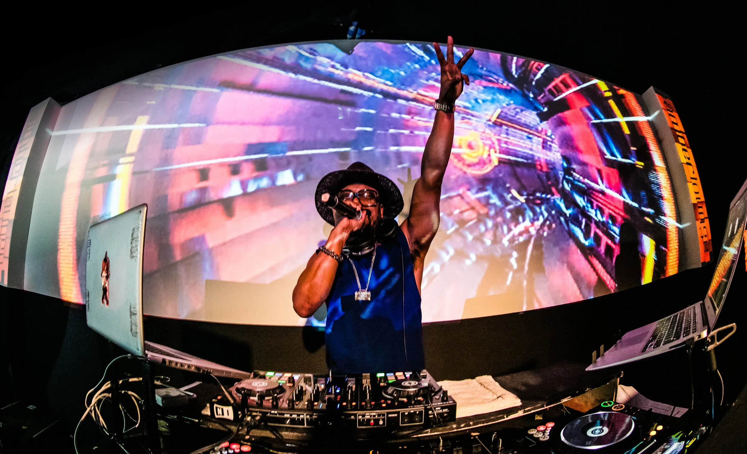
Brand activations + global brand partners

Click to
play video:

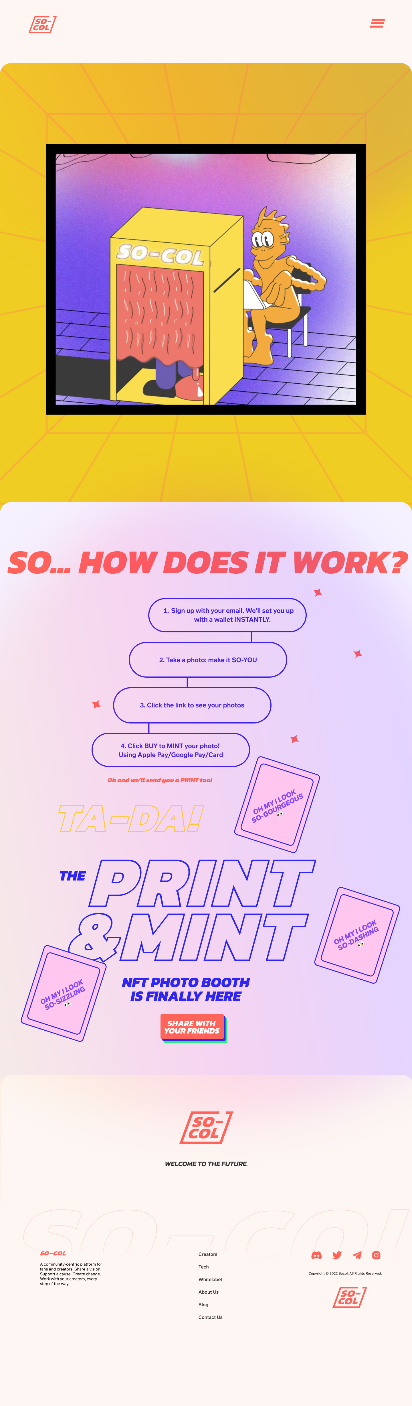
The nft
Photo booth
IT PRINTS AND MINTS!
You step in, take a photo and get a link to your NFT in minutes (dare I say seconds?). Oh and you get a print too! It prints and mints.
SO-COL’s mission is to make NFTs easy for creators, influencers, and fans to create, use and enjoy. Why not show that ease of creation with the simple magic of a photo booth? An NFT photo booth. We looked at creating a portable version for trade shows too 👀

Launch partners for Nothing and Habitué:

NFT launch partner for Nothing’s Cube NFTs

NFT partner for exclusive private chef dinner in LA, seat reserved only via NFT worth $1000+


Created the global NFT pass for F1’s official after party partner, Amber Lounge.
Guests could share the NFT with friends, or rent it rather, an they got a whole bunch of VIP perks with it as well.
Evolution of the brand logo.
When I joined the logo looked like this. I felt it could be punchier, more like a stamp, be something that had more of a statement like the creators we want to work with. The logo was a nod to the hashtag being a social platform, but it lacked a story.

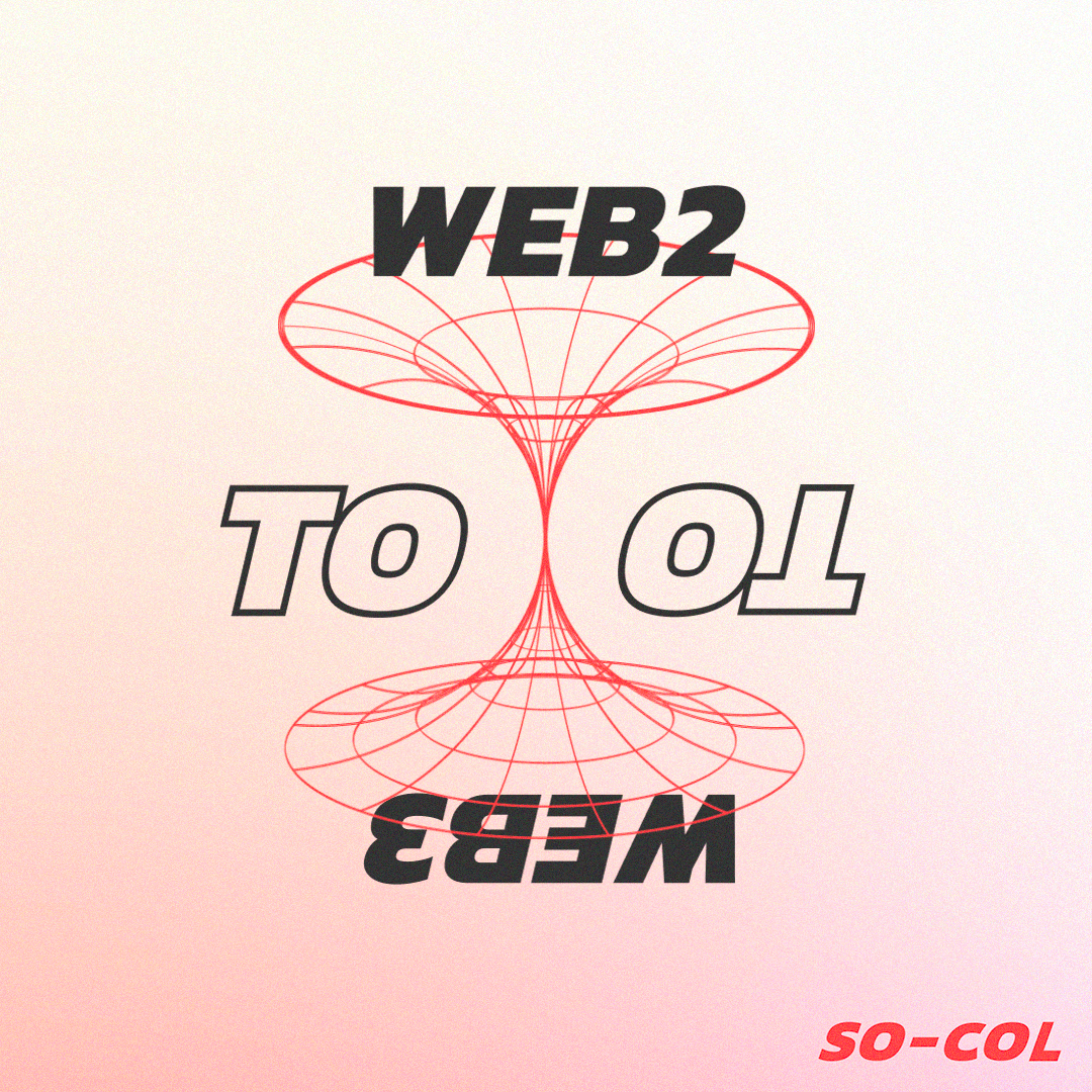
The mission of the brand when I joined was to bridge the gap between Web2 and Web3. I wanted the logo to reflect the pass to web3, the NFTs used in the communities, and the nod to the idea of bridging the gap with the space above the “-” filled by it.

I first had the idea of changing the spelling from Socol, to SO-COL which was a more natural representation of the ode to social collectables. Spelling the brand as SO-COL created the opportunity to play with the brand and create a distinct brand tone of voice. With everything becoming SO-Something. And that’s how Socol became SO-COOL.